Vibe has been a part of the Novell family for seven years, and although it’s had a few name changes between here and there, it has since become known as a solid platform for business collaboration, internal social networking, project management, and more.
For some, it’s become the primary method interaction on projects and company topics, and for others, its mouldable, dynamic interface has lent itself to the creation of knowledge repositories of every kind, from intranet pages and forums, to workspaces and wikis.
Vibe 3.4 is a collaboration cornerstone for our customers, but when it came time for us to think about the next version, the engineering team behind Novell Vibe wanted to take it further. A modernised interface, fine-tuned performance enhancements, powerful productivity improvements, and a better, more intuitive way to share were “must-have” features for this new version of Vibe, code-named Hudson. A list of “want-to-haves” appeared right next to it.
Fast-forward, and we find ourselves not far from the release of Hudson, which we now know as Vibe 4.0. All of those ”must-have” features, and many of the “want-to-haves,” are getting some final shine and polish before we send it out into the world. There’s been some remodeling to the Vibe you know, but we’re confident that as the dust clears, you’ll love what we’ve done with the place.
Catch the Vibe
Vibe has always been functional and powerful, but even the best tools can be improved. One such improvement was to give our Human Factors engineers the chance to assess the interface and optimise the user experience – or as they put it, “if our fans can’t find a capability, then it might as well not be there at all.”
Vibe 4.0 aims to shorten the learning curve of new and existing Vibe users by bubbling up oft-used functionality, flattening the interface, and rewording some of the areas and commands that have caused confusion in the past.
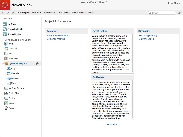
The end result is a cleaner, clearer, more accessible Vibe that offers a more immediately productive workflow. Folders are larger, icons and buttons are more readable, and areas have been renamed for greater clarity. (Figure 1).

When a user clicks a button or initiates a command, they do so expecting a certain response, and whether they’re marking all entries in a folder read/unread, dragging and dropping a file from their desktop, or using the browser navigation buttons to navigate to previously visited pages, Vibe 4.0 aims to give them exactly what they expect.
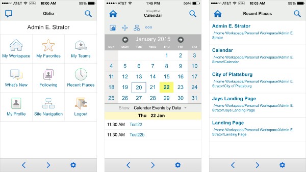
The Vibe mobile apps (available for Android and iOS devices) have benefited from this user-centric redesign as well, and they now present organised, task-oriented interactions that help people get where they need to go more quickly, and do what they need to do more effectively. (Figure 2, over page).

Sharing is Caring
Past versions of Vibe featured robust internal sharing capabilities, though menu commands were sometimes veiled by a less-than-intuitive means of access. For example, some users were chagrined to find that even though they had shared an entry with a team member, they had forgotten to grant that person rights to access the shared entry, which created a bothersome second step. Past versions of Vibe also lacked the ability to share effectively with external users.
In Vibe 4.0, the very mechanics of sharing have been reworked, and the idea of granting access rights has been more tightly integrated into the sharing procedure.
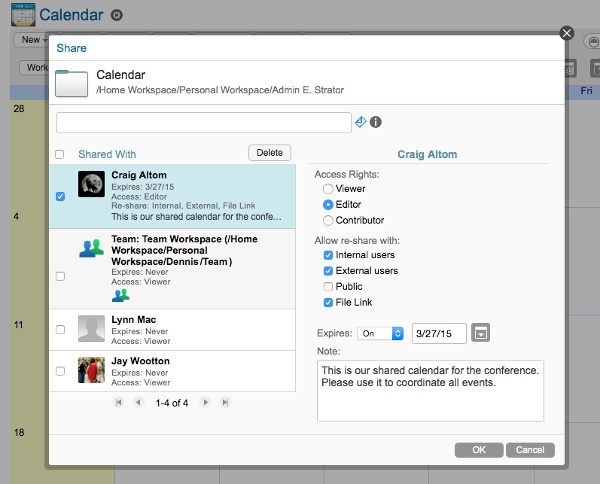
Users wanting to access the sharing dialog will find that it is not only more discoverable and accessible, but that the task itself is easier to accomplish. Collaborators you would like to share with can be added by name (internal) or email (external collaborators), and access rights can be granted and revoked for each person before the sender clicks OK. (Figure 3).

When the system administrator enables it, Vibe 4.0 allows your users to use the same Share dialog to invite external users to collaborate with them on projects and discussions in Vibe.
When added, people outside your Vibe system will receive an invitation to quickly create a Vibe account with which to access Vibe, then view or modify the shared entries, depending on the rights they were given.
If sharing is caring, then Vibe 4.0 just got a lot more love.
(Desk)Top of the Heap
Many customers love the Vibe desktop application and use it as part of their daily workflow, and with all the love the web and mobile applications were getting in Vibe 4.0, we knew it was time to add some new capabilities for our desktop application faithful.
We knew that there were those who wanted to use the Vibe desktop application as exclusively as possible, and we enacted changes to support that possibility.
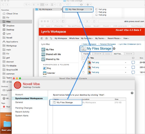
First, with larger Vibe installations and an abundance of folder changes, syncing down folder and entry changes could be a time-consuming hassle. Performance enhancements have been put into place that decrease sync times and deal with changes in a more intelligent way. (Figure 4).

Second, we’ve applied some of the same usability principles to the interface, cleaned it up, and added the ability to create and delete folders, or delete files, right from the desktop application.
Too Much to Tell
We’re excited about all the incredible features that Vibe 4.0 will bring to our users, and though we’ve covered some of the highlights, when it comes to a release like Hudson, we’d run out of space if we explored them all!
Suffice it to say, many of the improvements our customers have been clamouring for are present in the latest version of Vibe, including:
- The ability to download folders as CSV files
- Applying multiple filters to folders
- Enhancements to entry pinning
- Unfollowing people or updates from What’s New
- …and more!
Vibe 4.0 is the first gigantic step on a promising journey, and it’s a release that Novell is proud to offer to you, our customers and partners. Take the plunge, and upgrade to Vibe 4.0!
(This article was first published in OHM28, 1-2015, p27-29).


