
More or less since the release of Filr 1.0, customers have asked if it is possible to customise the branding of Filr with their own corporate colours and logos. In some cases, it was to get rid of, or otherwise hide, the Novell name and other times it was just to conform to their own corporate “look and feel” branding guidelines. The good news is that in Filr 3.0, we finally address both of those issues. While you could always brand the Web interface in Filr, the Desktop and Mobile apps were essentially hard-coded with Novell branding.
In Filr 3.0, all of this branding has been replaced with the new Micro Focus branding and for those customers with the Filr Advanced Edition, they can now upload their own branding to the Desktop (Windows and Mac) and Mobile (iOS and Android) apps. By the way – if anyone is interested, there is a promotion going on at the moment where Filr Standard customers can upgrade to Filr Advanced for free. Please see the Filr product page at https://www.microfocus.com/products/filr/resources/#faq.
To demonstrate the branding, I chose to revive an old brand, originally introduced with NetWare 5.0 – Digital Airlines. The NetWare team at the time created a fictitious organisation called Digital Airlines and released a fully configured and branded demo environment on a CD under this name. I figured that Digital Airlines would be way more interesting, and a better demonstration of the branding capabilities, especially since Filr was already branding as Micro Focus.
Web Branding
Branding the web interface has been available since Filr 1.0. It is also something that you do not need to upgrade to Filr Advanced in order to do. Web branding has been included in every version of Filr.
To begin branding the web interface, make sure you are logged in as Admin, and not an Administrator equivalent, on the default port 8080 or 8443 (basically not the 9443 Appliance administration port). If you are a designated Administrator, things will not work properly unless you log in as Admin.
Once logged in as Admin, you will need to access the Administrator Console and then the last item on the menu on the left, Custom Branding. The first tab of Site Branding is the branding for the web interface.
The branding that you see here is similar to the Vibe branding, which makes sense given Filr’s origins.
Login Dialog
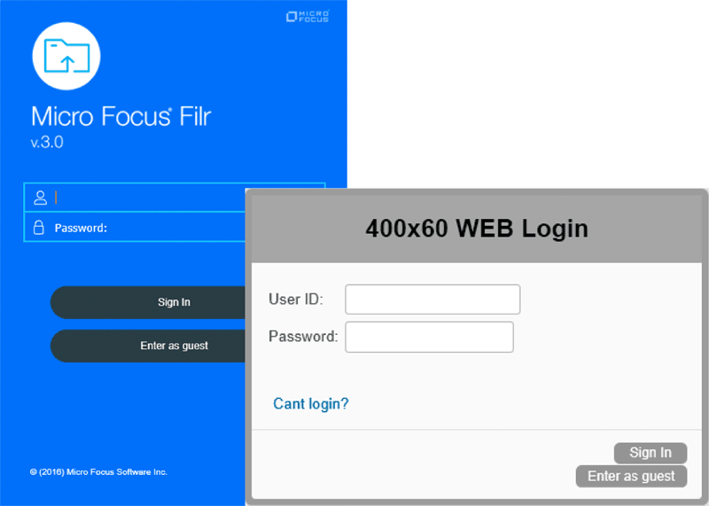
The first thing you see when accessing Filr is the Login Dialog. The administrator interface, and the documentation, suggest an image of 400 x 60 pixels. When encountering something like this however, I like to mock something up to see what I am dealing with before getting “creative” and designing something to fill the space. Figure 1 shows the default Filr login dialog alongside my test of a grey 400 x 60 px box. Clearly there is a significant size difference and from this I decided to do some testing and came to realise that this is a suggestion and not a fixed limitation.
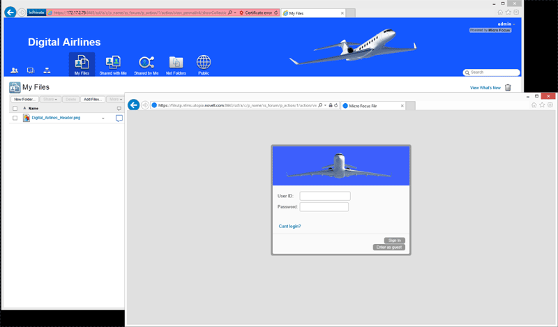
I decided I probably didn’t want to go any wider than 400 pixels, but if necessary could go higher. With that, I sought out some images that might be appropriate for an organisation such as Digital Airlines. I found an interesting looking image which, I could make work as a 400 x 100 px image. See Figure 2, which also contains the web branding in addition to the login dialog, for the final effect.
Branding The Header
There are several approaches to branding the header, or banner, across the top of the page. You can simply upload an image and a different colour for the background but I like to take the extra step and instead opt for the Advanced Branding (figure 3). Again if you are familiar with Vibe, the editing capabilities you see here are the same.
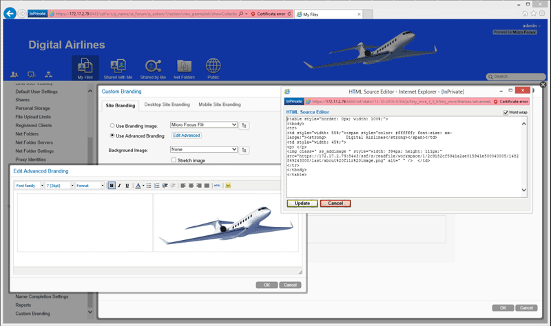
When doing something like this, I like to use tables and designate column and table widths as a percentage of the screen size. That way, as the browser and screen resizes, if you use percentages to define the table and cell size, the branding will adjust accordingly. Unfortunately, the default table option in the editor does not let you specify the proper sizes of the table.
There is an HTML button on the menu which lets you see the HTML code behind the scenes. By editing this directly I find it easier to get what I want. I am by no means an HTML wizard but with the help of Google and some trial and error, I was able to get something that works. Figure 3 shows the Advanced editing and the HTML source behind what you see on the screen.
If you refer again to Figure 2, you will see the final effect of the Login Dialog and the header branding that I was able to put together. Personally, I have had a lot of experience with Vibe prior to this and again, this is not new to Filr either, so this was something I was able to do fairly easily. Hopefully you have had a chance to similarly experiment with this before now.
Desktop Branding
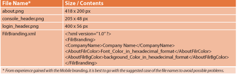
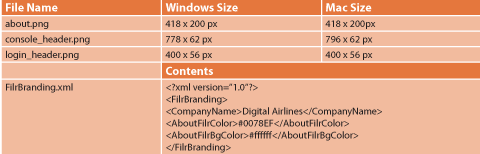
Unlike the web interface, Desktop branding is something completely new to Filr. Let’s start with the more common Windows desktop branding. Once again login as Admin and from the Administration Console, select Custom Branding and then the Desktop Site Branding tab. From what can be seen here, you are expected to upload some branding files. From the documentation it appears you will need three images plus an XML file – all zipped up into a single file, as shown in Table 1.
Since this is brand new, and I didn’t have any previous experience with this, I opted to create some dummy files as per the specifications in order to get a sense of what is possible with this new branding.
If you look at Figure 4, you can see what all of these branding options look like in one image. While it does brand the Desktop app as advertised, there are a couple of things which you need to consider:
- The console_header.png is somewhat stuck over to the left and isn’t quite centred vertically. Additionally, it has the text of Desktop Console through the middle of it.
- Similarly, the about.png has text through the middle of this.
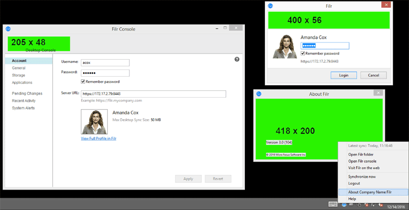
The good thing is, now that we know these issues, we can plan around them.
Unfortunately, in this release of Filr there is nothing that can be done about the Desktop Console text. This is planned to be removed in the 3.2 release later this year.
Since we’re stuck with this for now, we will have to plan accordingly. We’ll want to make sure that there is no image anywhere near this as this text is in the foreground of the console_header.png image and will otherwise block whatever is behind it.
The other problem that I have is with the suggested size of this image. It just doesn’t really fit into the dialog box the way I would like. Fortunately, the suggested size of the images is exactly that – a suggestion.
Through some trial and error I found that I can increase the size of this image to more evenly fill the dialog box. See Table 2 below for the sizes that I came up with.
Similarly, the About Filr dialog also has text that we cannot do anything about, but the dialog window is much larger and the text is in the lower left corner.
The documentation does not differentiate between branding the Windows Desktop and the Mac desktop. When I went through these same steps however, I discovered that on the Mac, the image sizes were slightly different. Table 2 shows the new image sizes that I came up with for Windows and Mac that worked for me.
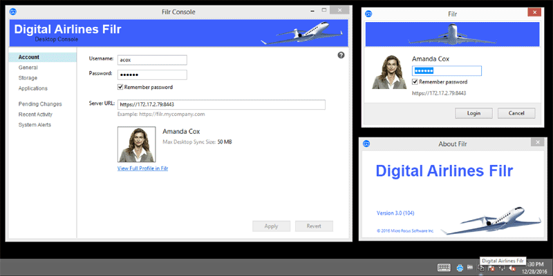
You should do you own tests to come up with something appropriate for your organisation’s branding and look and feel. Figure 5 shows the new branding I was able to come up with for the Windows Desktop app – the Mac is similar.
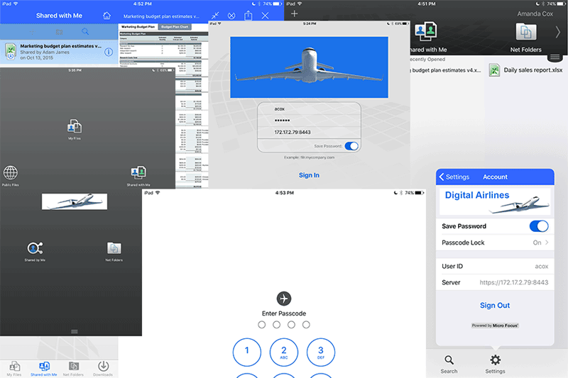
Mobile Branding – iOS
Branding the iOS client follows a similar path as Windows and Mac. There are a number of images that need to be created, and along with an XML file, are then zipped up and uploaded into Filr. These are the things to consider:
- You will need three versions of each image file. Each version is at a different resolution so that it displays properly on the various screen sizes of the iOS devices. I’m not an iOS developer but to me it seems that you cannot predict which of the 3 different resolution files will be used. From what I’ve been able to discern, it’s the device that decides, based on its screen resolution and what files are available to it.
- The Filr documentation provides a link to the iOS Human Interface Guidelines published by Apple. One of the first things that these guidelines state, that is very important, is that “On a standard-resolution screen, one point (1/72 of an inch) is equal to one pixel.”
When I first started, I thought, because of the small size of these images, I would bump the resolution of the images way up, to 400-600 pixels per inch when I was editing them in Photoshop. This ended up creating images that were multiple megabytes in size. This in turn blew up the mobile app. Fortunately this has since been fixed, but as per the guidelines, and something that’s since been confirmed with one of our iOS developers, you don’t need to go to that level of resolution for the images. One point is 1/72 of an inch – or, 72 pixels is one inch. Using 72 pixels per inch as a resolution is just fine.
- Upon initial release of the mobile app, image file names were case sensitive. This has since been resolved but it doesn’t hurt to do what the instructions tell you to do.
- The documentation is relatively clear about which images go where. There is however one caveat to this is the iPhone. On larger screen devices, the Filr_icon_login.png image is used on the login screen. On iPhones however, our UX Designers felt the screen was too small to support this so they opted to use Filr_header.png instead. Just be aware of that as you pick your graphics and so on.
With all of this in mind, you should be able to go ahead and create your images. Before going ahead with developing “production” images, I did some testing with generic content. You may want to do the same just to get a feel for it but fortunately I discovered the iOS app doesn’t have any of the unexpected text or anything like the Desktop apps did.
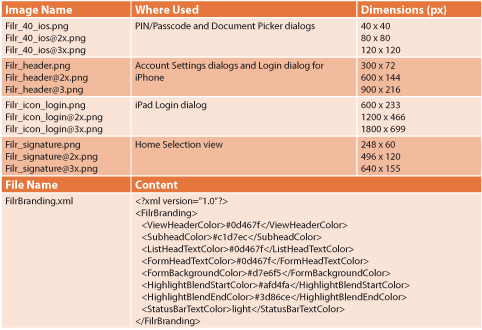
Table 3 shows the images you’ll need along with their respective sizes and the completed branding for the iOS app can be seen in Figure 6.
I hope that, from everything you’ve seen so far, you get the idea of how the new Filr branding works. You can follow the same process to brand the other two mobile apps – Android and Windows. Obviously, for more detailed instructions please refer to the official documentation – specifically the Maintenance Best Practices Guide, section 4.
Also, in addition to Open Horizons, you will also want to follow the Cool Solutions Community and the Micro Focus Filr and Networking Services and the Micro Focus Support @ Training YouTube channels as I (and others) regularly post tips, tricks, updates, up there.
This article was first published in OH Magazine Issue 36, 2017/1, p7-11